This is about
Design
15 minutes
13 Apr 2023
This is about
Design
15 minutes
13 Apr 2023
Extending realities for design & development — an XR Conversation

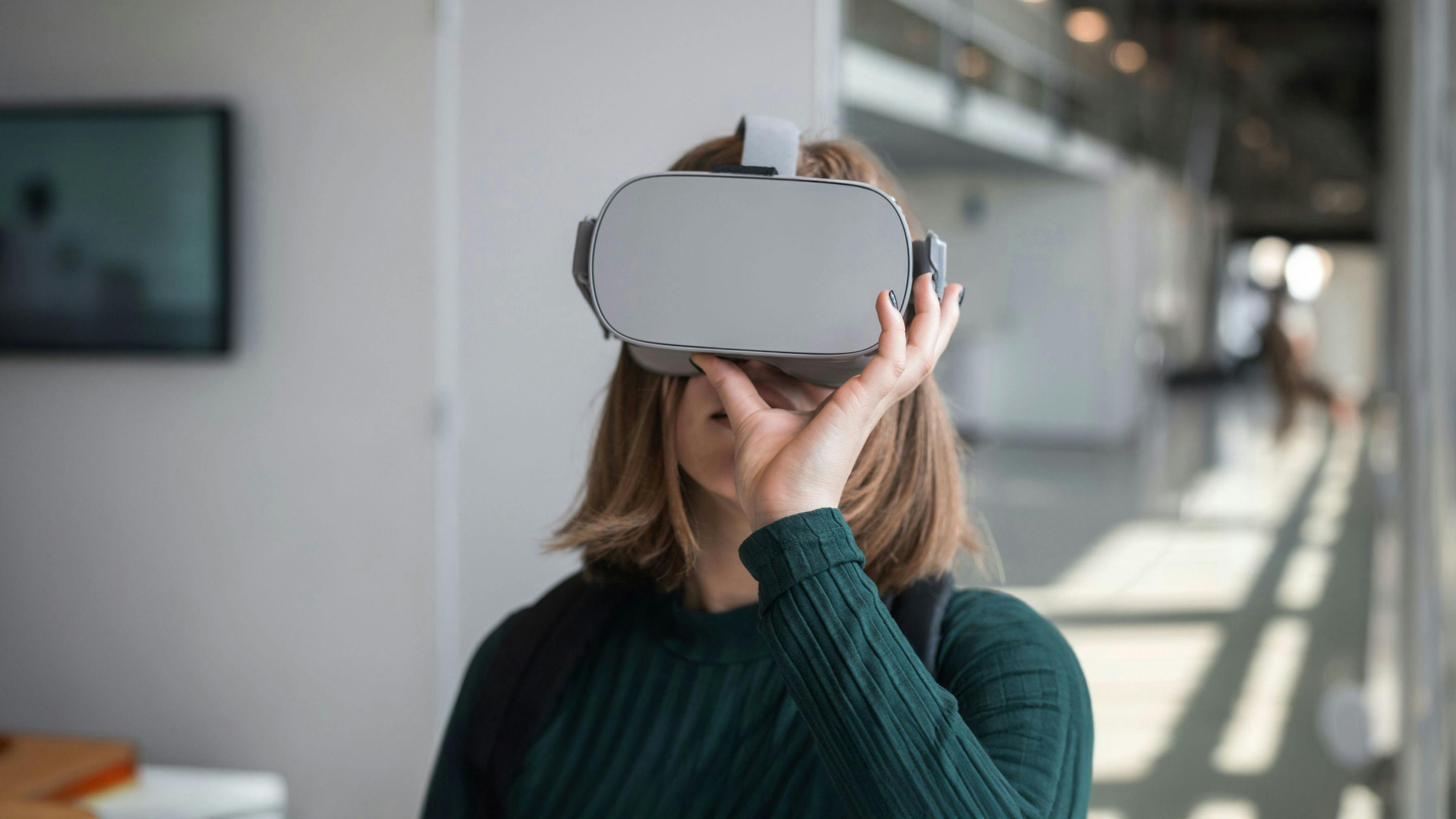
2023 may be the year when extended reality, also known as XR, really takes off for a broader audience. The highly anticipated upcoming launch of Apple's XR device, combined with the increasing accessibility and quality of headsets, means that XR, which includes virtual reality (VR) and augmented reality (AR), may be on the brink of mainstream popularity.
Are you curious about extended reality, what the future holds or how to approach an XR project from a design and development point of view? We talked to some of the 14islands team currently working on exciting XR projects to bring you some of our unique insights.
What excites you about working with XR?
Aline Kesting, Visual Design Director: "As digital designers, we have our ways of working. When it comes to web design, we know what we're doing and what works. However, designing for XR requires a completely different approach. In XR, users interact with digital content in a way that's more immersive and natural than traditional screen-based interfaces, such as phones or computers. In XR, you're not sitting in front of the screen. You are the screen. However, as digital designers, it’s easy to get so accustomed to screens that we put them in XR as well, including buttons and UI elements that we are used to designing. But what we really should try to get inspired by is reality. Humans were not made to sit in front of a screen. We’re made to pick up objects and interact with people and to speak and to listen. In that way, XR forces us to change the whole way we’re thinking about design."
Tell us about an XR project that you’ve been working on
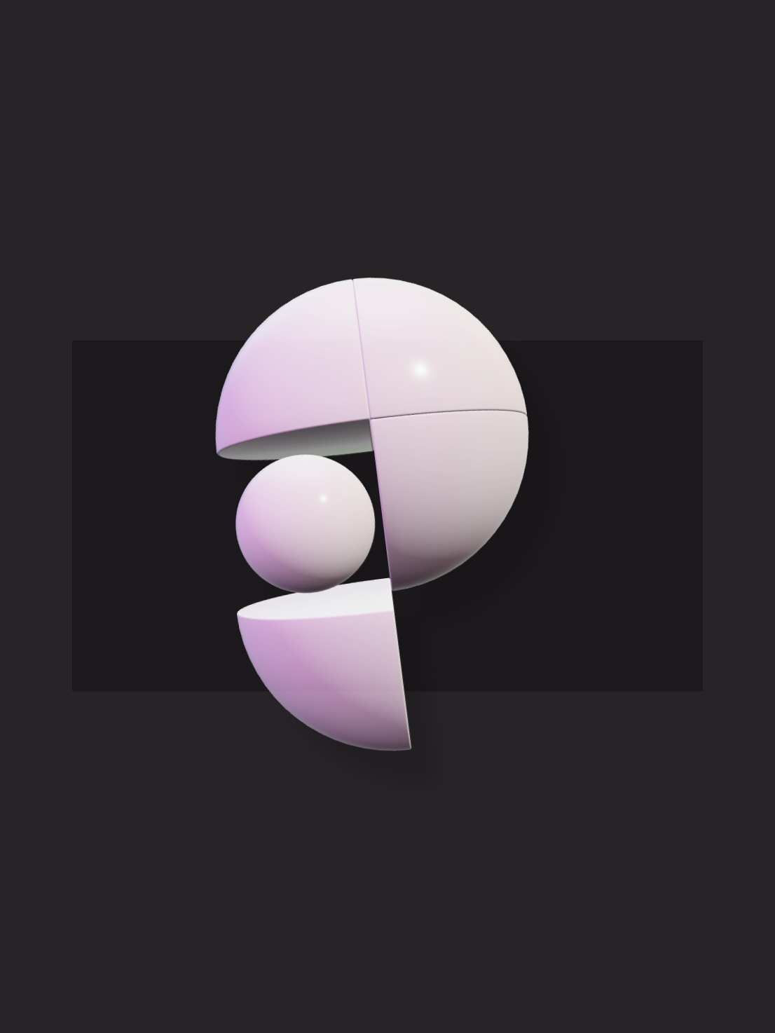
Aline: "We also had the opportunity to work on a spatial brand for XR, which was interesting. While we're well aware of the principles of branding and have helped many great brands come to life, it turned out that designing an XR-first spatial brand forced us to reevaluate everything we thought we knew. Instead of creating a 2D image to be displayed on a website or printed on a piece of paper, we were suddenly facing an object that users will interact with in 3D. That relationship is completely different to an object than it is flat on a screen or a piece of paper."
David: "We started hacking with Web XR back when it was called Web VR, which was the early standard. We did some early experiments back then, which was fun. But in recent times, the standard changed to be called Web XR because it also includes augmented reality and not just virtual reality.
One of the coolest client projects we’ve done was creating the website for Pluto. We normally make websites that are responsive, sites that work both on mobile and desktop. But in this case, we also had to enhance the site to work in an XR environment. To do that, we use a principle called progressive enhancement, where we don't assume that the browser has specific capabilities, we instead use feature detection to enhance the content only if the browser supports it. It’s similar to how we would start styling a traditional website, by starting with a small mobile screen and then if the screen is wider, we can reorganize the content to take advantage of this screen space. The same principle applies for XR. If we detect that your device has support for a spatial environment we can organize the content in a 3D space."
How do you balance visual impact with clarity and simplicity in an XR experience?
Another thing we’ve noticed is that it’s hard to consume a lot of text in XR. It's more about interacting with objects and animations. The XR experience shouldn’t have to depend on sharpness and high-resolution content. It would be nice if there was a global setting for scale to make XR more accessible to people with poor vision."
How do you create a cohesive visual identity for an XR project that aligns with the client's brand?
In the brand guidelines that we created for Pluto, we included a big section on motion principles, interactions and relationships. We did storyboards of interactions and ideas for voice recognition and sound design. Different states show what happens if the brand icon is happy or when it’s sad and how it would fit every different user. Of course, guidelines would be different depending on every brand, but I think the whole personality enhancement is something we don’t take into account in 2D branding."
How do you create a sense of presence and immersion for the user in an XR experience?
It's not all about imitating reality though, but also adding a magic twist. And it's usually the magic twist that is going to create a memorable experience. If we only try to imitate reality, we would soon get into something very boring. So we always need to bring surprises. It's the surprises that make it fun.
When it comes to the branding process, you have to both design and code spatial brand objects because you don't want to just import a GLB model and then look at something static. You want to create a relationship with iconic objects. You want to ask questions like; how does it move? How does it interact? How does it sound? How does it react to your voice? To your touch? To your presence? What gives it personality? All of these things are what will make an object feel branded. And all of this has to be implemented in code. That's why designers need to work alongside developers."
Pierre: "If you want to create more immersiveness, it’s beneficial to make use of all the senses. Sound is of course something that can create a big impact. Especially if it's spatial sound, like things moving around you giving cues, hints and audio feedback on interactions. That definitely makes an experience more immersive. And since you're not multitasking in web XR like you might when you're browsing normal websites, it is a good opportunity to use all the tools available and immerse the user. In XR, you’re in “full screen mode” by default.
When it comes to AR, the environment is essentially the physical location you're in. In this case, we try to use physical references to make XR objects and how you interact with them, similar to how the user would expect them to behave in the environment they’re in. This gives users a better idea of what they can do with these objects. However, if you're in VR, anything is possible and even something like gravity may be different. For instance, if you're in a space scene, you wouldn't expect objects to drop with real-life gravity. Therefore, it depends on the scene you're making and what you think the user expects."
David: "Nowadays, you shouldn't limit yourself to VR because AR is coming so strong. Since you’re not in control of the background in AR, like you would be in VR, you really need to create objects that work for any background by using a physics based lighting approach for your materials. The experience becomes very unrealistic if you're in a dark environment, but an object is super bright. Objects need to feel believable and react to their surroundings in order to create a seamless experience. So we’re learning that the way to go is to design for AR first and then add a VR environment around it instead of the opposite way around."
How can you do tests and incorporate feedback from users or stakeholders in XR projects?
For usability testing, it’s easy to just put the headset on people and see how they react. To increase usability it’s good to not make a super complex workflow for the user. For example, if you see a box in VR, you can intuitively make the connection that you can probably open that box. On the contrary, if you don’t recognize an object, it’s hard to know how to interact with it.
We’ve also shared prototypes with stakeholders, who viewed them in VR and screen-shared their sessions with us. That lets them draw and give comments in VR and share their feedback in context. We’ve done shared sessions where everybody can be in the same space even though everyone connects remotely. This is a great way to give and receive feedback. You can easily point at an object or resize something in front of everyone, and that makes it even more immersive in terms of feedback in a video call, not being limited to explaining what you mean with just words."
David: "It's important to show prototype designs to stakeholders so they can actually try solutions in XR and give feedback along the way. Otherwise, it’s hard to understand what the scale is of this thing that you’ve designed. You have to hold it in your hand to actually see it and understand how it feels to interact with it. Brainstorming sessions in VR where we are collaborating in the same VR space has been a new and exciting way of working. It's very useful to be able to look at and discuss an object together in XR.
This is where WebXR really shines, we can easily ship a prototype that collaborators and stakeholders can access by just following a normal hyperlink. With native apps, stakeholders need to install apps before they can try them, which can be a complicated task when they are not yet available in the device app store. With the web, everything is just a link away, simply put on your headset, open the browser and type in the link."
How would you approach an XR project?
Pierre: "We try to be the bridge between the end user and what the client wants to achieve. When we do research, our goal is to create solutions that can explain advanced things for every type of user. Sometimes it's good that we don't know everything about a certain topic from the start since that means that we get to challenge ourselves to understand it without having enough background information, which is the case for most end-users. With a lot of our projects being related to new technology, we have to come up with creative solutions to explain something complex in a simple way. That's the fun part."
David: "In general, When it comes to the development process, XR requires a lot more prototyping and quick iterations between design and development. We need to try things like interactions and figuring out the real scale of items. It's important to try out interactions to make sure we can implement them and also work on the materials to test them out in a real setting. So from what we've seen, it is a very technical field and the process includes a lot more prototyping for developers to help designers figure out what's actually possible. We also need to be more careful in the QA phase to test on real devices because they can all behave very differently."
What makes a good collaborator when it comes to XR projects?
Aline: "For these projects it’s all about collaboration. It helps having past experiences and being able to build on top of them together with stakeholders. I think that if you are good at design as well as tech, you can execute on things such as spatial branding, where you should be able to interact with a brand. As mentioned, you have to code as well as design. It's 50% design and 50% development and I think that is something that we are good at at 14islands. You need to be a very nimble team, you have to be really strong in collaboration and you have to design and code, which is a combination that not so many companies actually offer."
David: "I think there's there's a lot of good design companies that do 3D design and a lot of good development studios out there. But I think what's unique for us is how we can do both. We have designers who understand both the XR medium and the technology behind it and we also have the developers to execute on those ideas. So we can both have a tight collaboration between design and tech, and we can make sure that we design something that we can actually build in the end. So we have the skills to produce it, build it and ship it. I think that's one of the things that makes 14islands unique and why clients want to work with us."
Pierre: "We're also good at adapting to the needs of the end user. And we're good at creating visually great-looking experiences. I don’t think it matters if it's XR, 2D or 3D. Our creative process lets us deliver something that works for every experience."
How do you see the use of XR evolving in the next few years? What emerging trends or technologies are you keeping an eye on?
Aline: "Something that I think everyone is waiting for is the launch of the new Apple XR device, to see what they bring to the table. I think the evolution of headsets becoming lighter, higher quality, higher resolution and more comfortable to wear for longer periods is going to improve things. In two years, it has already evolved quite a bit so I’m looking forward to seeing how that will keep evolving in the future."
Pierre: "The Apple headset is probably going to have simple applications that are very well done for the mainstream audience. This will help get people to start using XR, and with increased adoption and a lot of people using XR, it's going to be easier to find what’s not working as well as it should. At this stage, I feel like there are mostly experts and enthusiasts using XR, meaning we can’t really identify all the edge cases. I think learning how these experiences can be polished for a wider audience will have a big impact on the future of XR."
David: "I think we're past that hurdle where using XR feels like a lot of work because with these new portable devices it's so easy. You just put them on and you're in VR. So it has the potential to get wider adoption, especially with companies like Meta pouring tons of money into XR and designing tools for it. But I think we will need devices that are even more portable and easy to access. Like new AR glasses that are much more lightweight, something people could wear in public and not just at home."
Droplets
Droplets
Sign-up to get the latest insight from 14islands. We send a newsletter only once every quarter with inspirational links and creative news. It's short and sweet. You can unsubscribe it at any time.


