This is about
Code
7 minutes
17 Sep 2020
This is about
Code
7 minutes
17 Sep 2020
Creative Websites Roundup — Ep. 1

Episode 1: Creative Portfolios
Creative Websites Roundup is a blog series that showcases different styles of creative web projects, shedding some light on various (non-conventional) approaches in web design and development. We’ll dive into select works of digital designers and creative developers, analyze their key elements and see what’s so unique about their features that makes our heads turn. This first roundup explores digital portfolios — websites that exhibit work of modern-day creatives. So, let’s dive right in.
Gruev.space
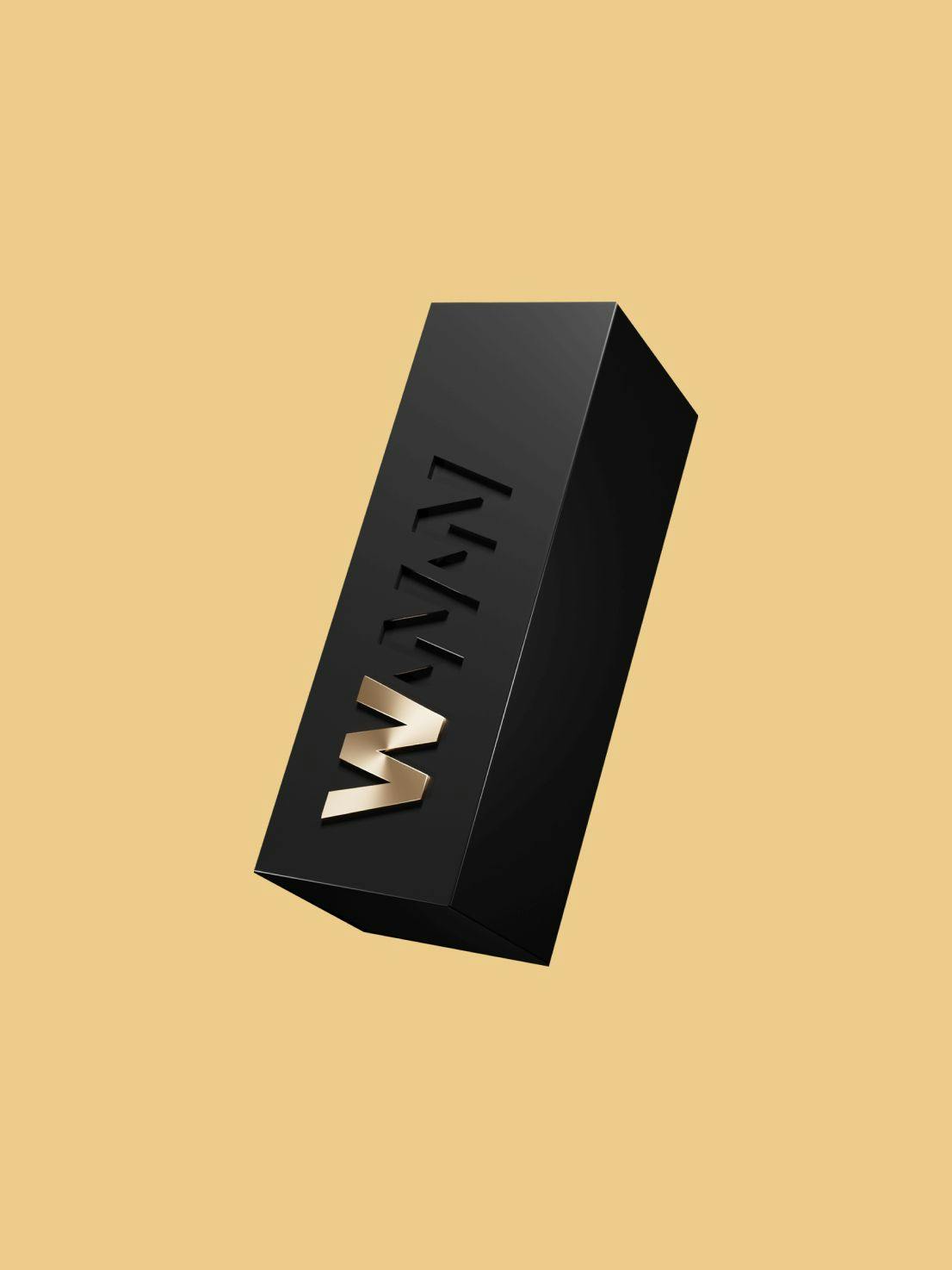
The portfolio of Vladimir Gruev, a UI/UX designer, welcomes the user with a minimal fullscreen layout. But in comes a twist — or better yet, an outside-the-box element (🙈).
When loading the website, a box-like object — a cube shape — rolls into view while scaling up toward the middle of the screen, positioning itself as the hero component on the homepage, suggesting interactivity while the headline animates in.
Relying on a technique that builds upon the basic 3D CSS cube, which all of the dev people can have a look at here, this cube, besides being an eye-catching component, has an interesting purpose. It responds to mousemove events and complements the site navigation. While hovering over the middle of the screen, the cube shows brief info about the designer. Moving the mouse toward either of the edges of the screen causes the cube to roll itself into the position which corresponds to the link the user is hovering over, showing a bit more information about what the one can expect when clicking on that link. It’s an unusual and interesting way of adding to the minimal composition of the homepage.
When clicking a link, the cube switches its purpose and becomes a page transition element, which shows fullscreen animations while the content loads, preserving an app-like feel for the whole website.
Note: Easter egg: open the console. 👀
And to provide some more context on the tech specs:
- Vue.js framework
- Modernizr feature detection library for detecting touch events
- Hammer.js for extensive touch gestures support, mainly used for cube rotation on mobile screens
- Cloudflare CDN
Google Tag Manager/Analytics for data gathering
View it live here: https://gruev.space/
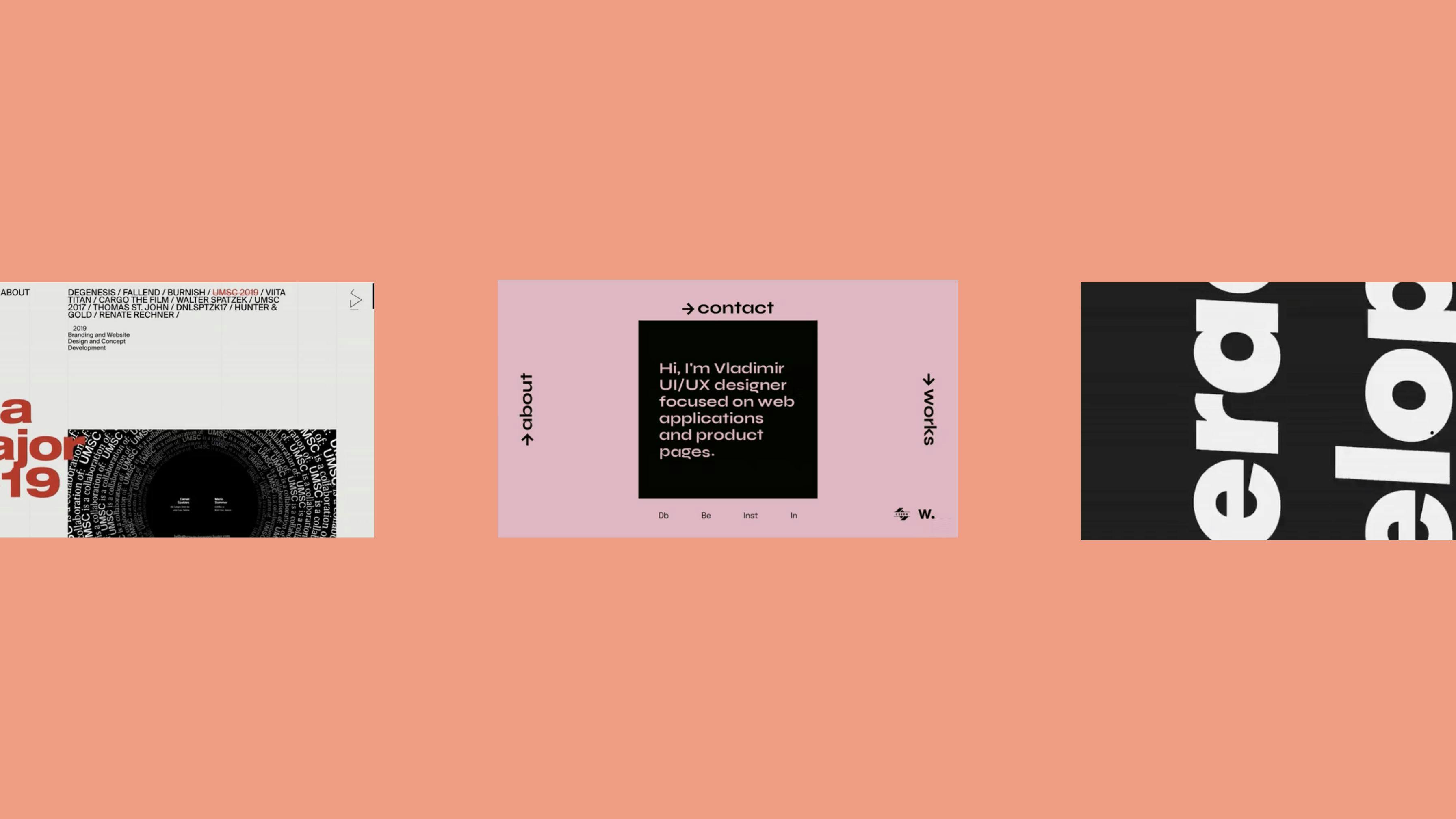
DanielSpatzek.com
The key feature of Daniel Spatzek’s portfolio resides in a Swiss Design derivative. This website sets its layout along the asymmetrical gridlines, which introduce a clear order into the page layout. The color palette is also kept minimal, which goes hand-in-hand with the philosophy on how this website is executed. Key aspects here are high performance and keeping the user right on the point, with no loaders or additional page-transition elements.
When landing upon the website’s homepage, the user dives straight into the projects list, which is always accessible as part of the main navigation. What stands out here is the way the title of each project is represented inside of the page content area. Relying on the asymmetry of the gridlines, the title is split between these columns, coming together on first scroll, which adds a unique note to this deliberately minimal content architecture.
Staying true to the monochrome UI color palette, scroll-based animations are kept within that sense — fading in individual textual and media items while scaling them up with a slightly skewed starting point for a more fluid feel. The same animation approach is used when transitioning between projects/pages, leaving the header always present in the viewport and switching out the content using dynamic motion-based crossfades of individual elements.
Tech used:
- Vue.js framework
- GSAP animation library
- Google Tag Manager/Analytics for data gathering
View live here: https://www.danielspatzek.com/
VincentSaisset.com
The black and white portfolio of Vincent Saïsset rests upon balancing bold typography-oriented design with the use of modern WebGL techniques to create a unique interactive one-page experience with minimalistic content. There are almost no visuals. Instead, the site’s big headlines fill up the space, and unusual scroll-based animations come into play and make this portfolio quite special.
The website starts off with the black background and an outlined V letter, which fills up to its solid white version while loading the site’s resources. A shy scroll label shows at the bottom of the screen, and the custom cursor becomes visible, allowing interaction with the on screen elements.
Once the user starts scrolling, the theme uncovers from dark to light in a horizontal direction, and enables the user to see more of the content and the experience ahead:
The interplay of typography — changing letter-spacing while scrolling, applying skew-based transforms to the content on scroll, combining scroll directions with different text orientations while keeping the WebGL cursor the main interaction tool. It reacts with the bold typeface that is rendered within the HTML canvas element, performing the trendy displacement shader effects both on the titles and on the project featured images as well — animating them in and out in a similar fashion.
An important thing to note here is that even though there is a lot of movement, diverse text orientations and scroll direction changes, one of the elements that keeps this dynamic yet compact web experience in place is a switch from light to dark theme between adjacent sections. This creates a clear visual difference between what’s in the view and what’s to come.
From a technical point, it’s worth mentioning that rendering typographic elements as WebGL components is quite challenging and positioning these elements alongside default HTML almost always requires the use of a virtual scrollbar that will move the contents as if they were in a normal DOM-flow. You can read in a greater detail about how we’ve used WebGL on our studio’s brand new website in the post David Lindkvist wrote here.
Tech used:
- WebGL
- GSAP animation library
- Google Tag Manager/Analytics for data gathering
View live here: https://www.vincentsaisset.com/
durimel.io
There are various different ways to keep one’s portfolio homepage minimal when it comes to the UI design, yet still be able to show a lot of content. Lionel Durimel’s portfolio uses one of the approaches.
Note: Neat idea with the URL. When visiting the URL it redirects to https://www.durimel.io/nel 😏
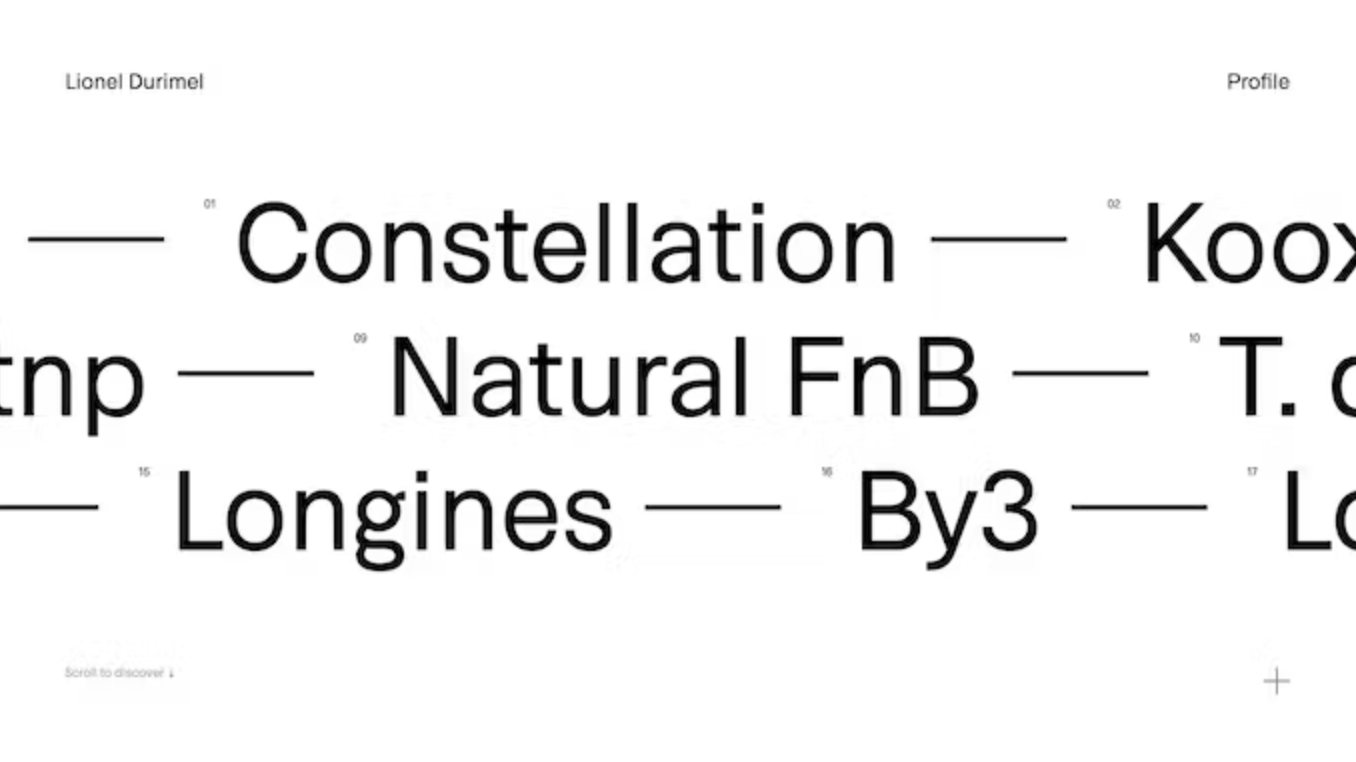
Alongside navigation links placed in the corners of the fullscreen homepage layout, the main feature is the three groups of projects divided into separate lines. These lines are individual carousel elements. What’s so interesting about this approach is that you get a bare-bones black text on white background layout as your first screen — a UI that doesn’t get in the way and has a lot of white space present. It has room to breathe. Once the user starts interacting with it, there’s a change of scenery.
On scroll, these three project lines start to move in opposite directions in a really interesting way. More specifically, the middle line moves in the opposite direction of the top and bottom lines. This style of motion-direction brings a fresh feel into the rigidly placed UI. While moving these lines, along comes a skew-transform effect, which is dependent on scroll direction, keeping the text content in a more pronounced movement. Another notable feature is that the content is placed in a loop, meaning that there is an infinite scroll effect no matter what the scroll direction is.
Finally, what really brings this whole approach together is the color palette. Landing upon the website, there is a visually clean UI with no colors or images. While hovering over any of the project titles, the presence of color gets triggered — the background color changes and a project-featured image is shown behind the project titles. While hovering over different project titles continuously, the featured images form a sort of carousel motion as well, resembling what happens with the project titles, but at a right angle.
Tech used:
- Vanilla JavaScript and CSS
- Google Analytics for data gathering
View live here: https://www.durimel.io/nel
Hope you’ve had a fun time reading and maybe saw something cool that will inspire you for your future projects. Until next time! 👋
Droplets
Droplets
Sign-up to get the latest insight from 14islands. We send a newsletter only once every quarter with inspirational links and creative news. It's short and sweet. You can unsubscribe it at any time.